Wrangling health board boundaries
This week we had a request from a colleague for a set of health board boundaries he could use in a PowerBI Shape Map. This ended up being slightly trickier than I expected — health board boundaries are published separately for each of the home nations, so step one was to round the all up from the official sources.
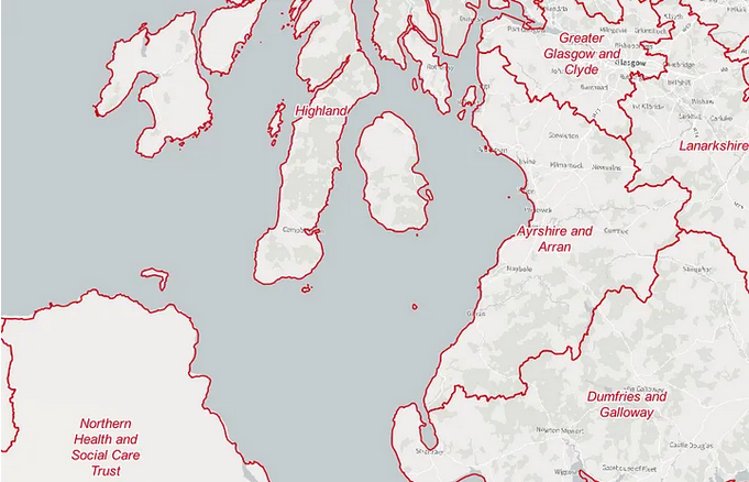 Screnshot of UK health board boundaries
Then, I merged them into a single file in QGIS and saved them to a GeoJSON. The first output came in at a 50MB which seemed like it would slow down PowerBI when loaded — so I ran QGIS’ new area-based simplification algorithm to get a 1.2MB file.
However, the Shape Map tool takes TopoJSON format as an input, and QGIS doesn’t export to TopoJSON. Instead, I ran the file through geojson.io, which can export as TopoJSON. Despite taking more steps than I expected, the end result worked with Shape Map in PowerBI, and our colleague can now use the map to filter his data on their dashboard.
ArcGIS Dashboards
Based on another request, I spend some time exploring ArcGIS Online’s dashboarding capabilities. It’s not as fully featured or as intuitive as PowerBI, but unlike PowerBI we have the ability to publish a AGOL dashboard outside the organisation. This means, for example, that we can make a dashboard and embed it on a public website, which at the moment we can’t do with PowerBI dashboards because of the way permissions are set up in Sharepoint/Office 365.
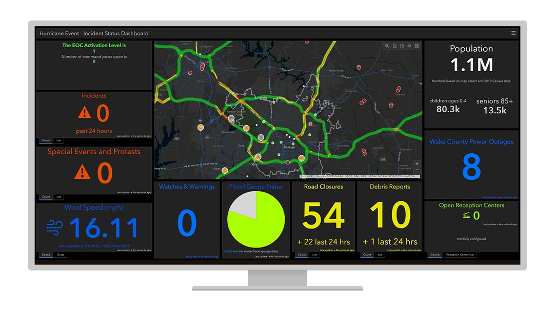
Example of an ArcGIS dashboard from the ESRI website. Source.
It took quite a lot of experimentation to get a dashboard that was useable and getting filters working takes a lot of clicking around various settings, but the demo dashboard was passable. In the end, the requestor decided they didn’t think a dashboard was right for what they want to show. Still, at least I’ll have a better idea of what’s possible with AGOL dashboards the next time they come up.
Climate risk maps
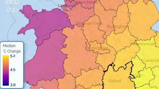 Screenshot of UK Climate Risk Indicators interface. Source.
Another request that came in was for a series of maps based on data from the UK Climate Risk Indicators website. I’ll continue working on this next week but for now I spent some time preparing the data — downloading the relevant data from the website and converting from GeoJSON to GeoPackage so that when I do come to use it it will be quicker to work with.