For a recent task I needed to show earthquake activity on a map. Since people have been making a lot of use of US Geological Survey maps and data, I wanted to use the same colour scheme they use to represent intensity:
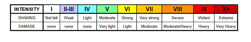
Adapting from this Wikipedia article, I created a discrete colour ramp in QGIS which I'm sharing here in case it's useful to others.